
We are pleased to announce that we have launched some new graphs in our Customer Portal on 20 January. You will find our data overviews in the top menu bar in the Customer Portal. We have been working hard on the following graphs:
Compare multi-year overviews by theme and period
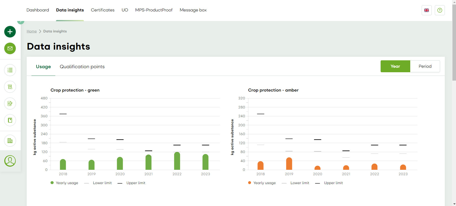
You my have already noticed the multi-year overviews on your dashboard over the past month. They give you an overview of your usage of crop protection agents, fertilisers and energy over the past five years. For crop protection, you will find graphs showing your usage of green, amber and red agents. You can now compare multiple periods or years in these new graphs.
Compare against the benchmark
You can also compare your usage against the benchmark. This benchmark was determined by the average of the bottom 20% of all MPS-ABC records with low usage and the average of the top 20% of all MPS-ABC records with high usage, respectively, measured in the same environmental cluster as yours. So you can now see at a glance how you are performing compared with other businesses. 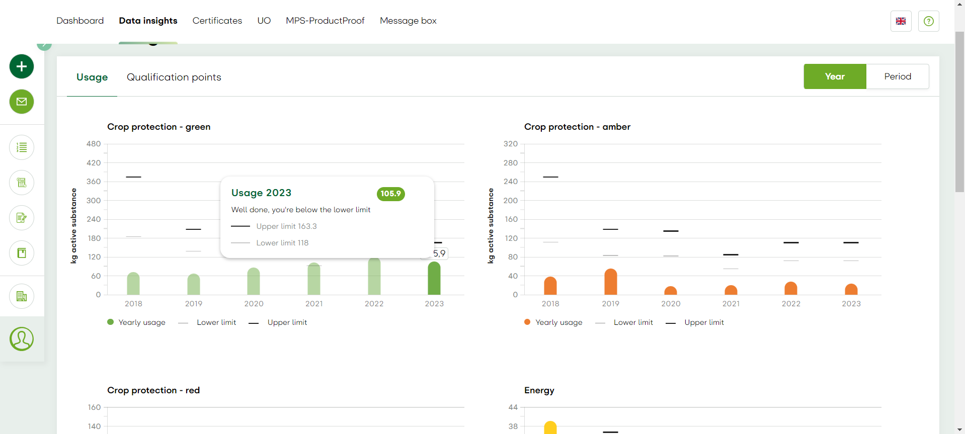
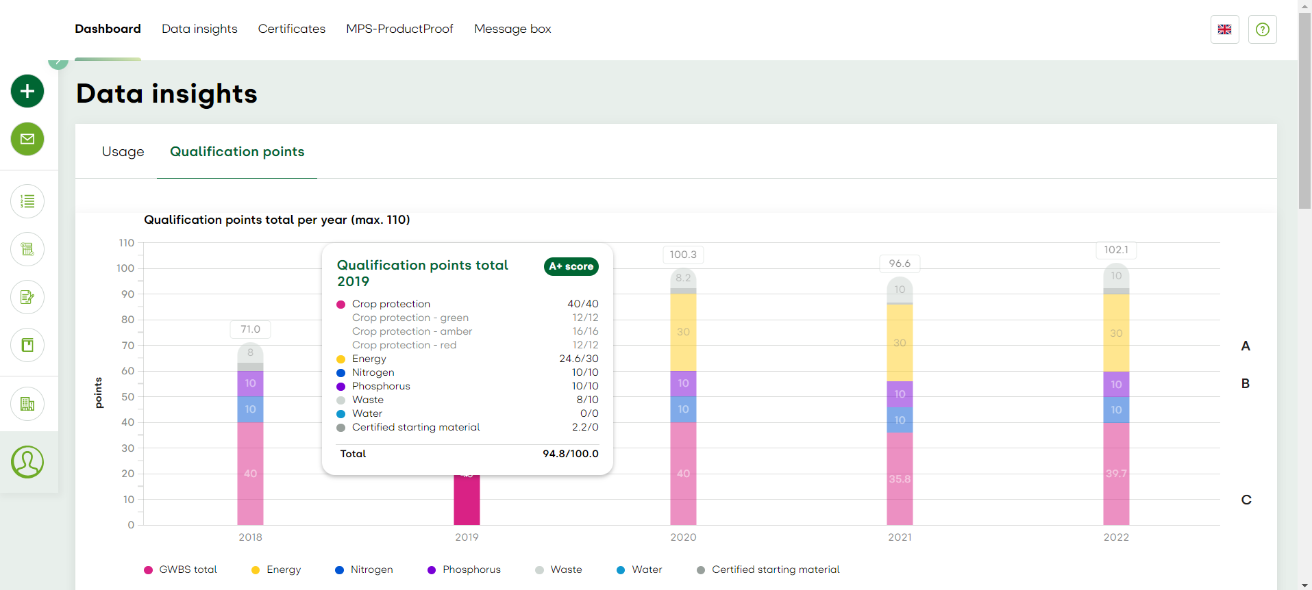
Composition of your qualification points
Lastly, from now on you will have access to quick insights into the composition of your qualification points. You can now immediately see exactly how many points you have been allocated in each area. In the right-hand margin you can check which qualification your total points place you in. This overview is a quick and easy way to see which qualifications your business has achieved over the past few years.
We are proud of this result and pleased to share it with you! We will continue to develop our data insights and therefore welcome your feedback. If you have any questions or suggestions for our data visualisation, please contact our data team by sending an e-mail to mps-data@my-mps.com.